Product Teardown — Airbnb: 5 Product lessons on how to introduce new features
Hey there!
This is Tear Them Down — Product Teardown case study #10.
If you are building (or looking to build) great products for your users, you will love our case studies!
In the previous teardown, I was talking about my long-drive companion — Spotify. But now that I have reached my destination, I need a place to stay. I opened Airbnb.

I have been using Airbnb for over 8 years, but looking at it through the lens of a product person, there are 5 interesting lessons on how to introduce new features, build feature loops, etc. I strongly recommend going through the full case study (3 min read), but key lessons are listed at the end of this if you do not have time.
If you are building (or looking to build) great products for your users, you will love our case studies! If you want our case studies to reach straight to your inbox, subscribe at: https://tearthemdown.substack.com/
1. Dark Patterns

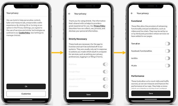
When I opened the app, I saw this page which was a mandatory setting. I could not use the app until I either press “Ok” or “Customize” and “Save”
😊What is good here?
Usually, a lot of products keep all the data collection enabled. These are simple dark patterns that lure a user into doing what the product wants rather than what’s right/good for the user. But to my surprise, Airbnb kept only the mandatory ones enabled and disabled all the optional ones. I felt good. I actually trust Airbnb more now.
Lesson 1.1: Do not use dark patterns to mislead users. It may give short-term benefits but users will stop trusting the product after a while.
😟What is not good here?
Maybe I am in a hurry and I do not want to look into this now but just make a booking as of now. But there is no “Come back later” or “Close for now” option. Unless I accept or invest my time and customize, I cannot move forward. This becomes a blocker to my usage. I might even just drop off.
These are forced nudges. They obstruct the user flow. Depending on the users your app has, the usage of such techniques might lead to user drop-offs.
Lesson 1.2: Do not use force nudges unless it is absolutely necessary. They obstruct the user flow and lead to user drop-offs or uninstalls.
Note: These forced nudges are usually used to make users stuck on the old app versions upgrade to the latest version also. But in that case, also, it might lead to uninstalls, if the users do not have space on their devices or high intent to update.
2. Homepage

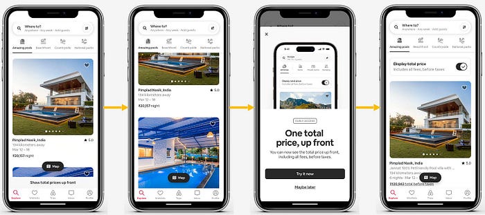
After customizing my choices, I landed on the homepage. I noticed a small banner just above the bottom navigation bar. Clicking on it opened the bottom sheet as shown on the third page.
😊What is good here?
The bottom banner (On the first screenshot) hides as I scroll through the listings and reappears when I reach the top. Although it is on the homepage, it is not obstructing my core experience.
Lesson 2.1: Identify subtle ways to introduce new features or share any details with your users. Do not obstruct the core experience.
Once I clicked on it, a bottom sheet appeared describing the feature. This works both for explaining the USP and the usability of the feature. A lot of times, products use walkthroughs and most users just dismiss them after the first/second step. But this popup with a clean design did a really good job of explaining both the USP & the usability.
Lesson 2.2: Instead of using walkthroughs, use story-telling to convey your feature’s USP & usability in simple ways.
3. Trips Tab / Product Loops

Just curious to see what else is going on in the app, I moved to the “Trips” tab.
😊What is good here?
Instead of showing only my booking history, they are helping me book again easily by simply adding a button to start searching once again. After reaching this tab, had there been no other action, a user might drop off. But now, at least some % of users might be captured to book again. Showing a clear path to your users will lead to higher engagement.
Lesson 3.1: Instead of leaving a page empty or just showing a list, create loops to make users take relevant action from such pages. This can help capture some % of churning users.
If you are building (or looking to build) great products for your users, you will love our case studies! If you want our case studies to reach straight to your inbox, subscribe at: https://tearthemdown.substack.com/
Lessons from the Airbnb app:

- Lesson 1.1: Do not use dark patterns to mislead users. It may give short-term benefits but users will stop trusting the product after a while.
- Lesson 1.2: Do not use force nudges unless it is absolutely necessary. They obstruct the user flow and lead to user drop-offs or uninstalls.
- Lesson 2.1: Identify subtle ways to introduce new features or share any details with your users. Do not obstruct the core experience.
- Lesson 2.2: Instead of using walkthroughs, use story-telling to convey your feature’s USP & usability in simple ways.
- Lesson 3.1: Instead of leaving a page empty or just showing a list, create loops to make users take relevant action from such pages. This can help capture some % of churning users.
If you are building (or looking to build) great products for your users, you will love our case studies! If you want our case studies to reach straight to your inbox, subscribe at: https://tearthemdown.substack.com/
If you have some time, feel free to read through other top product teardowns:
- 7 product lessons from Grofers rebranding
- Duolingo: Gamification for Retention
- Notion: Website & Onboarding lessons
We have spent ~10 hours crafting this case study. Take 5 seconds out to share it and help us grow! 😃
Will come back with another interesting case study. Bye!
