Product Teardown — Zepto: Drive User Activation through USP
Hey there!
Welcome to Tear Them Down — Product Teardown case study #7.
If you are building (or looking to build) great products for your users, you will love our case studies! If you want our case studies to reach straight to your inbox, subscribe at: https://tearthemdown.substack.com/
2021 brought a new wave of technologies and services such as Web3 (Crypto), BNPL, Neobanking (FinTech), Quick commerce, etc. In our last month’s product teardown, we had a look at how grofers rebranded to blinkit in pursuit of quick commerce dreams and lessons from that. Another new yet important player in that space is Zepto with a USP to deliver in just 10 minutes.
Looking at it through the lens of a product person, there are 6 interesting lessons on conveying the USP and driving User Activation. I strongly recommend going through the full case study (5 min read), but key lessons are listed down at the end of this if you do not have time.
PS: This is not a promotional post.
1. Website / Playstore
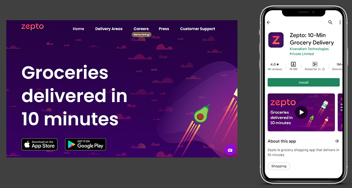
When I first read about Zepto, first, I went to their website and then to the Playstore. 10-Min Grocery delivery is well highlighted on the website and everywhere in the Playstore.
😊What is good here?
The USP of delivering groceries in 10 mins is well highlighted in all the user entry points. This is good for SEO and in registering in users’ minds on what your product is.
Lesson 1.1: Use your website content and Playstore/appstore listing content to highlight your USP or content that would improve your search engine positioning.
2. Cart — User Journey
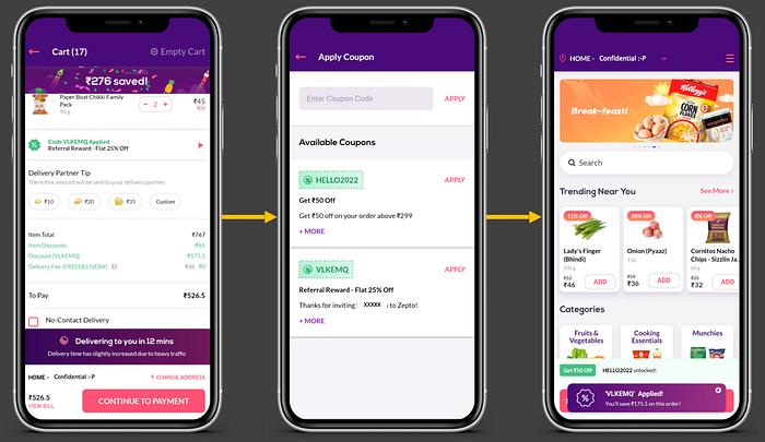
After adding products to the cart, I landed on the cart to checkout.
😊What is good here?
The cart screen (i.e. left-most screen) clearly highlights the delivery time and savings. When I saw these, I was more convinced that I should go ahead and place the order.
Lesson 2.1: Highlight the benefits of using your product — in terms of the value-added to the user — these can act as key trust indicators to improve the conversions in your funnel.
😟What is not good here?
On the first screen, I noticed that there is a coupon code applied that is giving me a discount. Wanting to maximize the savings :P, I wanted to see if there are any other coupon codes that give me better discounts. On the coupon codes screen, there are 2 available codes but it does not highlight which code is applied.
Lesson 2.2: When there are choices that benefit the user, pre-select the one that gives the highest benefit to the user and clearly highlight that. Those small rewards can make the app seamless for the user and improve the trust.
👋[Optional] Good to have:
In the last screen, after the coupon code is applied, the snackbar showing that the “coupon code is applied” is blocking the checkout CTA. I had to wait till the snackbar disappeared or make an additional click.
Lesson 2.3: When there are snackbars or modals, do not place them blocking the key CTAs as these could add friction in the user journey and impact the UX.
3. Order Tracking — User Activation
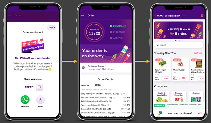
After making the payment, I saw the popup as shown on the left-most screen.
😊What is good here?
Given I have placed the order and had a good experience i.e. I have passed User Activation, seeing the referral campaign might actually push me to refer other friends to use this app. Even if I do not want to do it, I can skip it.
Lesson 3.1: After the user realizes the value in your product (i.e. User Activation), give contextual nudges to make the user do what you need. Make sure to give skip option to be user-friendly to those who do not want to do it.
😟What is not good here?
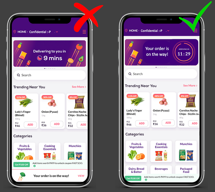
After closing the popup and moving to the home screen (i.e. rightmost screen), on the bottom, I see that my order is on the way. Also, the main banner is still promoting the 9 mins delivery. Given my order tracking already helps me understand that Zepto can fulfill orders in 9 mins, they are making the content redundant.
Also, it is highly unlikely of a user to place another order (while one order is in progress) seeing this promotion. So they could’ve used the space to make it easier for me to track the order — that way they can show the 9 min delivery proposition in practice.
Lesson 3.2: Use the homepage banners not only to promote but also to deliver the key information that would help the users’ navigation easier and demonstrate the USP in an actionable way instead of a plain statement.
🤔How it could’ve been:
Giving the order countdown/tracking on the home screen banner would’ve made the tracking simpler and the value realization faster for me.
Lessons from the Zepto app:

- Lesson 1.1: Use your website content and Playstore/AppStore listing content to highlight your USP or content that would improve your search engine positioning
- Lesson 2.1: Highlight the benefits of using your product — in terms of the value-added to the user — these can act as key trust indicators to improve the conversions in your funnel
- Lesson 2.2: When there are choices that benefit the user, pre-select the one that gives the highest benefit to the user and clearly highlight that. Those small rewards can make the app seamless for the user and improve the trust
- Lesson 2.3: When there are snackbars or modals, do not place them blocking the key CTAs as these could add friction in the user journey and impact the UX
- Lesson 3.1: After the user realizes the value in your product (i.e. User Activation), give contextual nudges to make the user do what you need. Make sure to give skip option to be user-friendly to those who do not want to do it
- Lesson 3.2: Use the homepage banners not only to promote but also to deliver the key information that would help the users’ navigation easier and demonstrate the USP in an actionable way instead of a plain statement
If you want our case studies to reach straight to your inbox, subscribe at: https://tearthemdown.substack.com/
If you have some time, feel free to read through other top product teardowns:
We have spent ~18 hours crafting this case study. Take 5 seconds out to share it and help us grow! 😃
Will come back with another interesting case study. Bye!
